DCR - Solutions


About the company
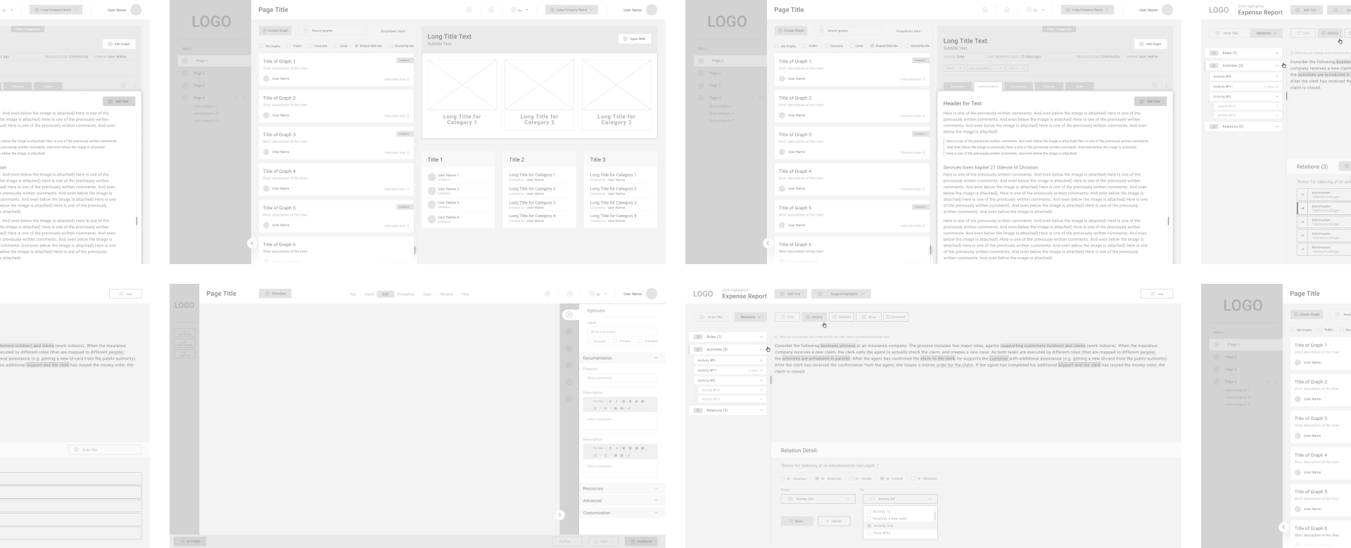
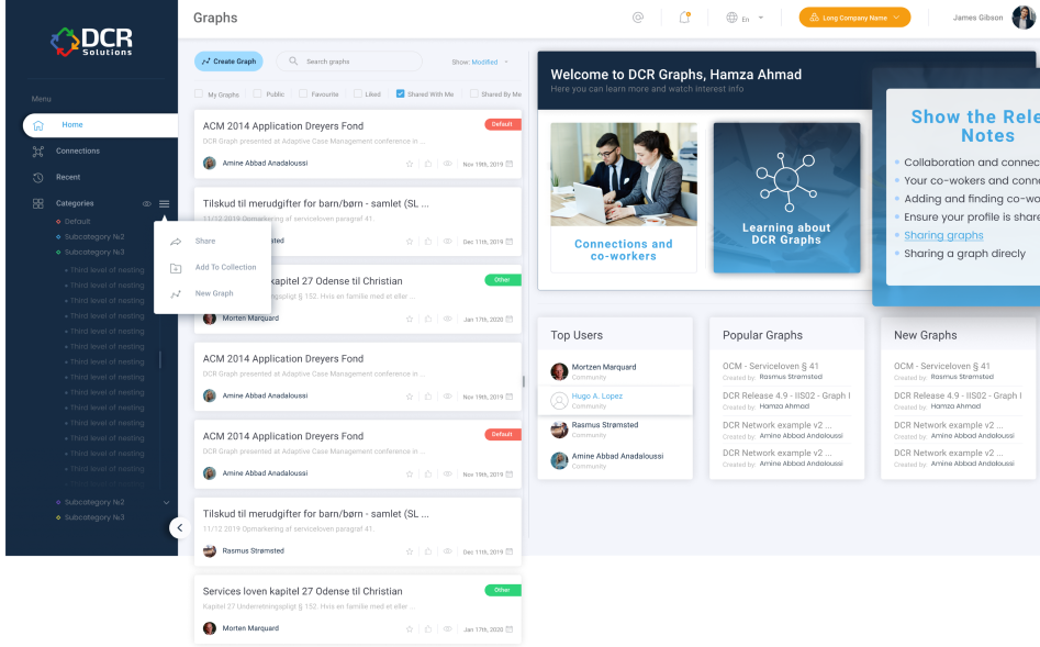
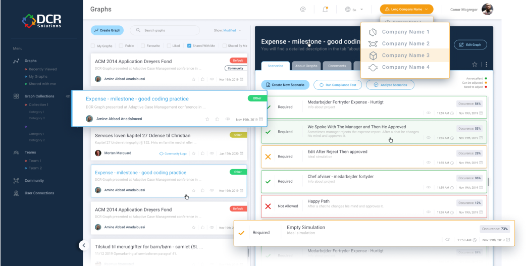
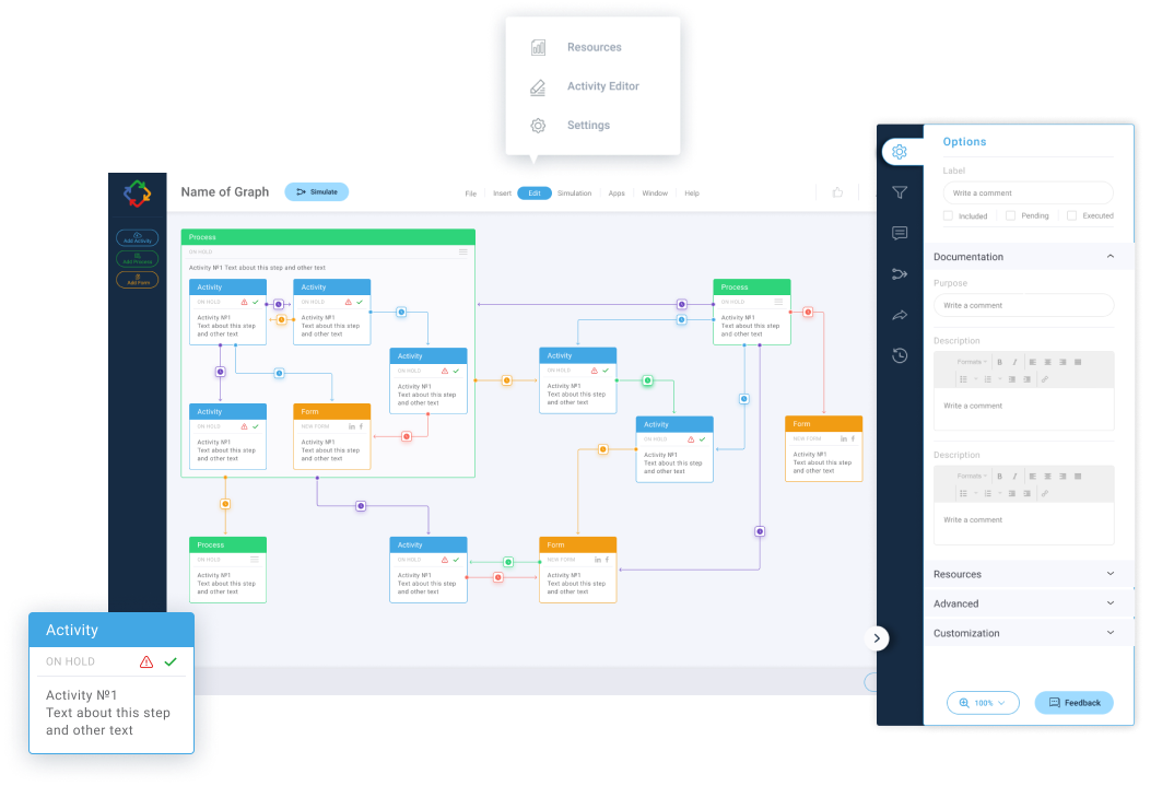
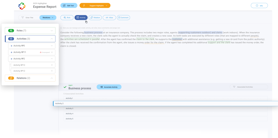
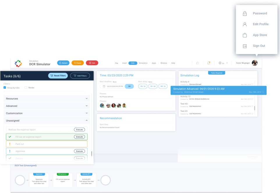
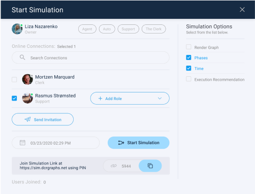
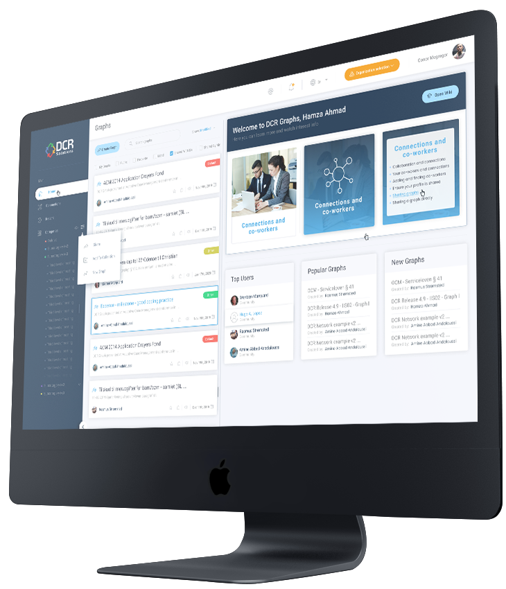
DCR Solutions is an innovative Danish IT company that digitizes complex workflows and develops user-supported IT systems.
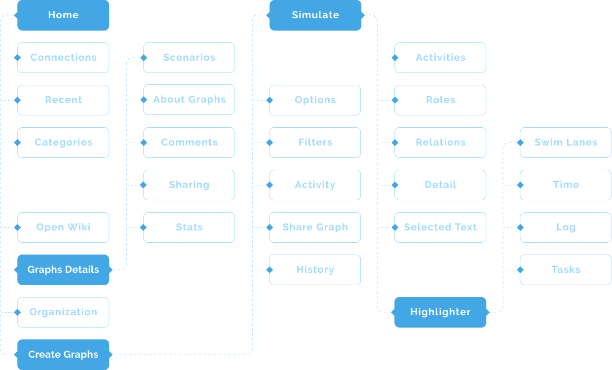
On their platform, they create various graphs and schemes for displaying statistics, which step by step help to solve business problems , such as attracting new personnel, company expenses and insurance process.

Analysis and solutions

Detailed analysis
In order to provide comprehensive solution to the existing design problems, we studied the platform in detail, identifying its weaknesses.

Defining business goals
Our specialists analyzed customers’ complaints, discussed their wishes, determined the goals and objectives of the service, as well as conducted analytics based on heat maps, discussed key user scenarios and prioritized them.

Proposal with the solutions
It was obvious that the DCR Solutions platform needed a significant upgrade. We suggested updating the interface, creating a new UI-kit and shorter user scripts, changing the placement of individual blocks and elements for better user experience.


User flow
The relationship between pages and their main elements was complicated. For clarity and ease of perception a convenient User Flow was created.
The connections shown in this diagram has improved the perception and navigation process in the application.


Prototypes
Prototyping allowed us to speed up the entire design process, see the whole picture of the application, and also use the project budget in a more rational way.
Based on the analysis, we arranged the elements and blocks on the portal in a different way, resorting to minimal changes on the site so as not to complicate further user interaction with the service.
Due to the prototype, the client was able to see the changes and evaluate new capabilities of his product. In addition, we have come up with some new useful user scripts.
Thus, we have managed to significantly improve the usability of the DCR Solutions portal.


Challenge
Despite the popularity of the platform and high-level demand for its services, the company began to receive complaints regarding service convenience.
Due to the inconvenient and difficult UX design, as well as outdated and chaotic UI design, the popularity of the service began to decline significantly. As a result, there was a churn of customers.
Since the portal is aimed at solving a huge number of client’s tasks, but does not have a common established system, clients could not quickly and simply achieve their main goals, which meant that the key function of the portal could not be successfully completed.

Brand Identity
Since the client already had a ready-made logo with 4 main colors - yellow-orange, red, blue and green, we preferred to stick to exactly this color scheme in order to preserve the concept of the site, as well as the general perception and associations of the service and company by clients.
Based on these colors, we have developed an individual UI kit for a unified website style with various elements, checkboxes, buttons, alining with the style of the company.
The main color of the site was chosen to be blue with its various shades, as it goes well with SAAS, is associated with stability, durability, reliability, does not distract attention and does not cause negative emotions.


Design concepts
80+ UI elements created
While working on the UI design, we redesigned all the buttons on the site, visually expanding them and making them more rounded, while leaving the original blue color, which helped to preserve the associative connections and simplify user interactions on the site.


50+ custom icons
Adding unified icons to certain sections of the portal refreshed the appearance, diluted a large amount of text, and strengthened the user's associative connections with specific actions.
4 ideas of user interactions
Our team also managed to successfully combine the serious topics of the portal and thematic images, without distracting the attention of users.


7 ideas of highlighting
By adding more air between the elements of the site and drawing the boundaries between the blocks, we managed to make the portal visually easier, and the interaction on the site more convenient.
3 ways to show easy navigation
By creating checkboxes we have improved the process of finding necessary information on the site, thus increasing the probability for a user to solve the problem and find the answer.


Error: Contact form not found.